
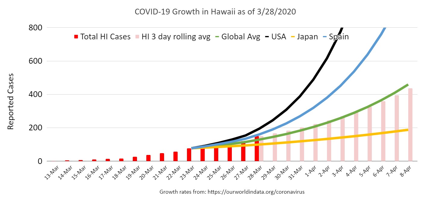
Big leap in new cases today puts our growth rate at about the global average. We’re thankfully still at 0 deaths.
Graphics were completely rebuilt:
Red bars are actual cases. PInk bars are forecast growth based on 3 day rolling average growth.
Trend lines from sample areas based on their last 4-5 days of sampling. Their growth curve is applied to Hawaii’s numbers so we can get a clear idea of how Hawaii compares to other parts of the world.
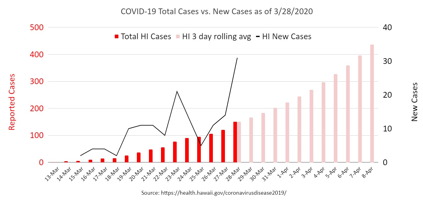
Also added a 2nd graph focused on Hawaii only with existing cases, forecasts, and number of new cases per day.
Let me know what you think!

What do you think?